Tuesday 14 August 2018

Categorize a Raster (DEM)

Although Raster files are visually attractive, they provide hard to interpret information because of is representing continuous data. So, they often are discretized in categories. There are many procedures to get it done (try QGis), but on this occasion, I will show how to do in R.

First, we need to load two libraries rgdal and raster, if you are using ess in emacs perhaps you must do some additional steps (you can email me). Now, we load our raster file, here, I'll use a Digital Elevation Model (DEM) of my country Peru (DEM_PERÚ.tif). You can download all the files in this link. However, this raster file doesn't match with the real form of my country, so we'll need to crop it, we'll do it later, but we are going to take advantage and load a vectorial shapefile which will be our mask (peru_disolved.shp). I recommend looking at the graphics to be sure that our files are loaded correctly.

 # 1. Packages  
 library(rgdal)          # Geospatial Data Abstraction Library  
 library(raster)          # Tools for gridded spatial data  
 # 2. Read DEM and convert to raster layer object  
 dem <- raster("~/Downloads/DEM_PERÚ.tif")     # raster  
 vperu <- readOGR("peru_disolved.shp", layer="peru_disolved")     # vectorial  
 plot(dem) # preliminar plotting  
Third, we are going to define the levels which will represent the categories. I have chosen only six levels (you can try others). We save the levels as a matrix. Fourth, using the function reclassify, we'll obtain a new file with the only the levels previously defined. Fifth, we obtain the graphic of the reclassified DEM.

 # 3. Generate a reclass matrix  
 m <- c(-Inf, 250, 1, 250, 500, 2, 500, 1000, 3, 1000, 2000, 4,  
     2000, 4500, 5, 4500, Inf, 6)     # specify dsired levels  
 rclmat <- matrix(m, ncol = 3, byrow = TRUE)  
 # 4. Reclassify the raster layer  
 reclassified_dem <- reclassify(dem, rclmat)  
 # 5. Plot the results  
 par(mfrow=c(1, 2))  
 plot(dem)  
 plot(reclassified_dem)  

The graphic is weird because we still need to crop it as a sixth step. You can quickly get it using the following code.

 # 6. Cropping  
 r1 <- crop(reclassified_dem, extent(vperu))  
 r2 <- mask(r1, vperu)  
 plot(r2)  


If you wish, you can save the files:

 # 7. Save new raster  
 writeRaster(reclassified_dem, "~/Downloads/reclassified_dem.tif", drivername="GTiff",  
       type = "Float32")  
 writeRaster(dem_crop, "~/Downloads/dem_crop.tif", drivername="GTiff",  
       type = "Float32")  

All the code is:

 # -*- coding: utf-8 -*-  
 # Author: Irbin B. Llanqui  
 #"""  
 # Language: R script  
 # This is a temporary script file.  
 #"""  
 # 1. Packages  
 library(rgdal)          # Geospatial Data Abstraction Library  
 library(raster)          # Tools for gridded spatial data  
 # 2. Read DEM and convert to raster layer object  
 dem <- raster("~/Downloads/DEM_PERÚ.tif")     # raster  
 vperu <- readOGR("peru_disolved.shp", layer="peru_disolved")     # vectorial  
 plot(dem) # preliminar plotting  
 # 3. Generate a reclass matrix  
 m <- c(-Inf, 250, 1, 250, 500, 2, 500, 1000, 3, 1000, 2000, 4,  
     2000, 4500, 5, 4500, Inf, 6)     # specify dsired levels  
 rclmat <- matrix(m, ncol = 3, byrow = TRUE)  
 # 4. Reclassify the raster layer  
 reclassified_dem <- reclassify(dem, rclmat)  
 # 5. Plot the results  
 par(mfrow=c(1, 2))  
 plot(dem)  
 plot(reclassified_dem)  
 # 6. Cropping  
 r1 <- crop(reclassified_dem, extent(vperu))  
 r2 <- mask(r1, vperu)  
 plot(r2)  
 # 7. Save new raster  
 writeRaster(reclassified_dem, "~/Downloads/reclassified_dem.tif", drivername="GTiff",  
       type = "Float32")  
 writeRaster(dem_crop, "~/Downloads/dem_crop.tif", drivername="GTiff",  
       type = "Float32")  

That's all for today.

Monday 5 March 2018

A common error in adehabitatHR

Recently I figured out that in several forums people are asking about this error in the library adehabitatHR of R:

Error in getverticeshr.estUD(x[[i]], percent, ida = names(x)[i], unin,: The grid is too small to allow the estimation of home-range. You should rerun kernelUD with a larger extent parameter

Well, I'll try to explain this and solve it. First of all, this error occurs in the workflow to obtain polygons from a KDE volume, which is a common procedure in home range analysis.

In the first four steps of the following code, I simulate a dataset, which will represent the spatial position of two individuals.

 1
 2
 3
 4
 5
 6
 7
 8
 9
10
11
12
13
14
15
16
17
18
19
20
21
22
23
24
25
# -*- coding: utf-8 -*-
# Author: Irbin B. Llanqui

#"""
# Language: R script
# This is a temporary script file.
#"""

# 1. Packages
library(adehabitatHR)         # Package for spatal analysis

# 2. Empty Dataframe
points <- data.frame(ID = double())
XY_cor <- data.frame(X = double(),
                     Y = double())
# 3. Assigning values (this will be our spatial coordinates)
set.seed(17)
for(i in c(1:100)){
    if(i >= 50){points[i, 1] <- 1}
    else {points[i, 1] <- 2}
    XY_cor[i, 1] <- runif(1, 0, 100)
    XY_cor[i, 2] <- runif(1, 0, 100)}

# 4. Transform to SpatialDataframe
coordinates(points) <- XY_cor[, c("X", "Y")]
class(points)

Now, I will estimate the kernel density using those spatial points.

 1
 2
 3
 4
 5
 6
 7
 8
 9
10
11
12
13
14
15
16
17
18
19
20
21
22
23
24
25
26
27
28
# 5. Domain
x <- seq(0, 100, by=1.) # resolution is the pixel size you desire 
y <- seq(0, 100, by=1.)
xy <- expand.grid(x=x,y=y)
coordinates(xy) <- ~x+y
gridded(xy) <- TRUE
class(xy)

# 6. Kernel Density
kud_points <- kernelUD(points, h = "href", grid = xy)
image(kud_points)

# 7. Get the Volum
vud_points <- getvolumeUD(kud_points)

# 8. Get contour
levels <- c(50, 75, 95)
list <- vector(mode="list", length = 2)

list[[1]] <- as.image.SpatialGridDataFrame(vud_points[[1]])
list[[2]] <- as.image.SpatialGridDataFrame(vud_points[[2]])

# 9. Plot
par(mfrow = c(2, 1))
image(vud_points[[1]])
contour(list[[1]], add=TRUE, levels=levels)
image(vud_points[[2]])
contour(list[[2]], add=TRUE, levels=levels)

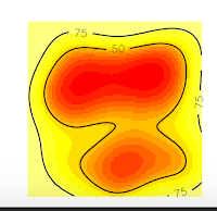
And we obtain these nice plots. Now, we want to extract the contour lines at 75% of probability density. For that, we will use the function to get vertices as the following code:


1
2
3
4
# 10. Get vertices (Will be an Error)
vkde_points <- getverticeshr(kud_points, percent = 75,
                                 unin = 'm', unout='m2')
plot(vkde_points)

And we will get an ERROR!! Specifically, we will obtain the error I introduced at the beginning of this post.


Error in getverticeshr.estUD(x[[i]], percent, ida = names(x)[i], unin,: The grid is too small to allow the estimation of home-range. You should rerun kernelUD with a larger extent parameter


But why this happened? If you are a shrewd observer, you'll notice in the above plots that, the contour line at 75% is cut, and our domain doesn't include it. So, that is the reason for the error, is that R can't estimate the vertices of the contour line at 75% precisely because they are no in the domain, they were not computed. On the contrary, the contour line at 50% is entirely inside the domain, so if we ask for this vertices, we won't have any error.


1
2
3
4
# 10. Get vertices (Will be an Error)
vkde_points <- getverticeshr(kud_points, percent = 50,
                                 unin = 'm', unout='m2')
plot(vkde_points)

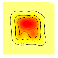
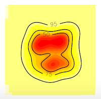
Now, if we want to extract 75% contour lines without an error, we only need to increase the grid in order to cover all the contour lines. In this case, I will increase the grid at 50 (see the item # 5. Domain x <- seq(-50, 150, by=1.) y <- seq(-50, 150, by=1.))


 1
 2
 3
 4
 5
 6
 7
 8
 9
10
11
12
13
14
15
16
17
18
19
20
21
22
23
24
25
26
27
28
29
30
31
32
33
# 5. Domain
x <- seq(-50, 150, by=1.) # resolution is the pixel size you desire 
y <- seq(-50, 150, by=1.)
xy <- expand.grid(x=x,y=y)
coordinates(xy) <- ~x+y
gridded(xy) <- TRUE
class(xy)

# 6. Kernel Density
kud_points <- kernelUD(points, h = "href", grid = xy)
image(kud_points)

# 7. Get the Volum
vud_points <- getvolumeUD(kud_points)

# 8. Get contour
levels <- c(50, 75, 95)
list <- vector(mode="list", length = 2)

list[[1]] <- as.image.SpatialGridDataFrame(vud_points[[1]])
list[[2]] <- as.image.SpatialGridDataFrame(vud_points[[2]])

# 9. Plot
par(mfrow = c(2, 1))
image(vud_points[[1]])
contour(list[[1]], add=TRUE, levels=levels)
image(vud_points[[2]])
contour(list[[2]], add=TRUE, levels=levels)

# 10. Get vertices (Will be an Error)
vkde_points <- getverticeshr(kud_points, percent = 75,
                                 unin = 'm', unout='m2')
plot(vkde_points)


Now, all the contour lines are inside the grid, so we'll no see the error message. And that's all.

Sunday 28 January 2018

On species accumulation curves

On this occasion, I will share some quick tips related to the implementation of Species Accumulation Curves (SAC) using R (in the future I'll teach you how to do this in Python). First of all, we have to remember that SAC is a tool to assess and/or compare the alpha diversity. For instance, we can imagine someone who wants to know the alpha diversity (Species richness) in a particular place; for that, a sampling protocol is carried out. If we imagine this scenario, we can realize that while the sampling is performed the number of new species registered will decrease with respect the time. That is because, at the beginning of the sampling, the common species will be detected, but later, it will be harder to find new species because only remain the rares. This idea can be visualized in the form of the following curve (Moreno & Haffer, 2000):


As you can see, the curve increases rapidly with a few sampling units, but, as long as the sampling continues, the slope curve rises slower. When the increase of new species tend to zero (slope equal to zero or asymptote) it means that the inventory is complete. Thus, at this point, we would have reached the richness of the study area. In R, there are several ways to obtain accumulation curves through data; for example, we can use the "vegan" and "BiodiversityR" packages:


 1
 2
 3
 4
 5
 6
 7
 8
 9
10
11
12
13
14
15
16
17
18
19
20
21
22
23
24
# Dependences
library("BiodiversityR")
library("vegan")

# Loading data
data(BCI)

# Using vegan package
sp1 <- specaccum(BCI, method = "exact")
sp2 <- specaccum(BCI, method = "random")

# Using BiodiversityR package
sp3 <- accumresult(BCI, method = "exact")
sp4 <- accumresult(BCI, method = "random")

# Comparing results using plots
par(mfrow=c(1,2))
plot(sp1, col = "black", lwd = 3, xlab = "Samples", ylab = "Richness",
     main = "exact")
plot(sp3, col = "red", xlab = "Samples", ylab = "Richness", add = TRUE)
plot(sp2, col = "black", lwd = 3, xlab = "Samples", ylab = "Richness",
     main = "random")
plot(sp4, col = "red", xlab = "Samples", ylab = "Richness", add = TRUE)
legend("bottomright", c("vegan","BiodiversityR"), col = c("black","red"), lty = 1)
As you can see, vegan and BiodiversityR packages give similar results. The exact (Chiarucci et al. 2008) and random (Gotelli & Colwell 2001) indicate the accumulation functions used to obtain smoothed accumulation curve. Both packages have more tools to analyse diversity, particularly, in vegan is very easy using estimators to assess the completeness of the inventory: Chao, Jackknife 1, Jackknife 2, and Bootstrapping.

 1
 2
 3
 4
 5
 6
 7
 8
 9
10
11
12
13
14
15
16
17
18
19
20
21
22
23
24
25
26
27
28
# Dependences
library("BiodiversityR")
library("vegan")

# Loading data
data(BCI)

# Using vegan package
sp1 <- specaccum(BCI, method = "exact")
sp2 <- specaccum(BCI, method = "random")

# Using BiodiversityR package
sp3 <- accumresult(BCI, method = "exact")
sp4 <- accumresult(BCI, method = "random")

# Comparing results using plots
par(mfrow=c(1,2))
plot(sp1, col = "black", lwd = 3, xlab = "Samples", ylab = "Richness",
     main = "exact")
plot(sp3, col = "red", xlab = "Samples", ylab = "Richness", add = TRUE)
plot(sp2, col = "black", lwd = 3, xlab = "Samples", ylab = "Richness",
     main = "random")
plot(sp4, col = "red", xlab = "Samples", ylab = "Richness", add = TRUE)
legend("bottomright", c("vegan","BiodiversityR"), col = c("black","red"), lty = 1)

# Estimators
sp1_pool <- poolaccum(BCI, permutations = 1000)
plot(sp1_pool)

The object created by "poolaccum" function gives you by default a figure using parameters of the "lattice" package:

But, it is not a very useful chart if we want to add the figure in a research presentation. For example, we likely wish to obtain just one plot without the frame, and all in black. Fortunately, we can modify the chart at our convenience. For example, Chao estimator is a great approach to assess the completeness of an inventory. So we want just this plot in an elegant way, whereby we need to delete the other sub-figures, remove some axes, box titles, change the colour, and so on. To do that, we can use the following code:


 1
 2
 3
 4
 5
 6
 7
 8
 9
10
11
12
13
14
15
16
17
18
19
20
21
22
23
24
25
26
27
28
29
30
31
32
33
34
35
36
37
38
39
# Dependences
library("BiodiversityR")
library("vegan")

# Loading data
data(BCI)

# Using vegan package
sp1 <- specaccum(BCI, method = "exact")
sp2 <- specaccum(BCI, method = "random")

# Using BiodiversityR package
sp3 <- accumresult(BCI, method = "exact")
sp4 <- accumresult(BCI, method = "random")

# Comparing results using plots
par(mfrow=c(1,2))
plot(sp1, col = "black", lwd = 3, xlab = "Samples", ylab = "Richness",
     main = "exact")
plot(sp3, col = "red", xlab = "Samples", ylab = "Richness", add = TRUE)
plot(sp2, col = "black", lwd = 3, xlab = "Samples", ylab = "Richness",
     main = "random")
plot(sp4, col = "red", xlab = "Samples", ylab = "Richness", add = TRUE)
legend("bottomright", c("vegan","BiodiversityR"), col = c("black","red"), lty = 1)

# Estimators
sp1_pool <- poolaccum(BCI, permutations = 1000)
plot(sp1_pool)

# Plot manipulating lattice
plot(sp1_pool, display = "chao", col = "black",  auto.key = FALSE,
     grid = F, strip = FALSE, xlab = "Sample",
     par.settings = list(axis.line = list(col = 0)),
     scales = list(col=1, tck=c(1,0)),
     panel = function(...){
         lims <- current.panel.limits()
         panel.xyplot(...)
         panel.abline(h=lims$ylim[1], v=lims$xlim[1])
     })

Done!, we have made an accumulation curve with 95% confidence intervals (CI). The chart shows us that the inventory is still incomplete because the CI of the Chao estimator is not stable. In the following figure, we can see how adding more sampling units make the Chao estimator stable. Therefore, in this case, we can conclude that the inventory is complete. The final richness or number of species is equal to the value of the asymptote of the Chao estimator.


REFERENCES

Chiarucci, A., Bacaro, G., Rocchini, D., & Fattorini, L. (2008). Discovering and rediscovering the sample-based rarefaction formula in the ecological literature. Community Ecology9(1), 121–123. http://doi.org/10.1556/ComEc.9.2008.1.14

Gotelli, N. J., & Colwell, R. K. (2001). Quantifying biodiversity: Procedures and pitfalls in the measurement and comparison of species richness. Ecology Letters, 4(4), 379–391. http://doi.org/10.1046/j.1461-0248.2001.00230.x

Moreno, C. E., & Halffter, G. (2000). Assessing the completeness of bat biodiversity inventories using species accumulation curves. Journal of Applied Ecology, 37(1), 149–158. http://doi.org/10.1046/j.1365-2664.2000.00483.x