Biological Complexity
Methods for studying biological phenomena.
Tuesday, 8 December 2020
Lotka Volterra Competition Model in Python - Part I
Thursday, 14 February 2019
Automatisation of figures' creation using Python
Recently, I had to arrange 60 images in ten arrays of 2x3 (2 columns, three rows). Luckily, I found a code in Python that can do the work for me. The code was written for Evan Rosica, and it can be found here.
Herein, an example of how the code works!
We are going to merge the following images in a matrix of 2x2:
In #1 I am loading the libraries required. Basically, this code use "PIL."
In #2 you need to specify the directory where your images are stored (line 16).
In #3 the most relevant is that you should understand that all images will be resized according to the first image of your directory (line 28). However, you can change it quickly.
In #4 is a loop which will add each image in a sequence. There is not much mystery here.
In #5 I create some boxes and label for my images. I think it is possible to create a loop for this. If you can improve it you are welcome to try!
In #6 The final result is showed and saved if you want (uncomment line 84).
Below the full code
And here, the final result.
As you can see this code can help us to save time if we need to arrange too many images, even if you are writing papers that demand merging a lot of figures.
Tuesday, 14 August 2018
Categorize a Raster (DEM)
First, we need to load two libraries rgdal and raster, if you are using ess in emacs perhaps you must do some additional steps (you can email me). Now, we load our raster file, here, I'll use a Digital Elevation Model (DEM) of my country Peru (DEM_PERÚ.tif). You can download all the files in this link. However, this raster file doesn't match with the real form of my country, so we'll need to crop it, we'll do it later, but we are going to take advantage and load a vectorial shapefile which will be our mask (peru_disolved.shp). I recommend looking at the graphics to be sure that our files are loaded correctly.
 # 1. Packages
 library(rgdal)          # Geospatial Data Abstraction Library
 library(raster)          # Tools for gridded spatial data
 # 2. Read DEM and convert to raster layer object
 dem <- raster("~/Downloads/DEM_PERÚ.tif")     # raster
 vperu <- readOGR("peru_disolved.shp", layer="peru_disolved")     # vectorial
 plot(dem) # preliminar plotting
 # 3. Generate a reclass matrix
 m <- c(-Inf, 250, 1, 250, 500, 2, 500, 1000, 3, 1000, 2000, 4,
     2000, 4500, 5, 4500, Inf, 6)     # specify dsired levels
 rclmat <- matrix(m, ncol = 3, byrow = TRUE)
 # 4. Reclassify the raster layer
 reclassified_dem <- reclassify(dem, rclmat)
 # 5. Plot the results
 par(mfrow=c(1, 2))
 plot(dem)
 plot(reclassified_dem)
The graphic is weird because we still need to crop it as a sixth step. You can quickly get it using the following code.
 # 6. Cropping
 r1 <- crop(reclassified_dem, extent(vperu))
 r2 <- mask(r1, vperu)
 plot(r2)
If you wish, you can save the files:
 # 7. Save new raster
 writeRaster(reclassified_dem, "~/Downloads/reclassified_dem.tif", drivername="GTiff",
       type = "Float32")
 writeRaster(dem_crop, "~/Downloads/dem_crop.tif", drivername="GTiff",
       type = "Float32")
All the code is:
 # -*- coding: utf-8 -*-
 # Author: Irbin B. Llanqui
 #"""
 # Language: R script
 # This is a temporary script file.
 #"""
 # 1. Packages
 library(rgdal)          # Geospatial Data Abstraction Library
 library(raster)          # Tools for gridded spatial data
 # 2. Read DEM and convert to raster layer object
 dem <- raster("~/Downloads/DEM_PERÚ.tif")     # raster
 vperu <- readOGR("peru_disolved.shp", layer="peru_disolved")     # vectorial
 plot(dem) # preliminar plotting
 # 3. Generate a reclass matrix
 m <- c(-Inf, 250, 1, 250, 500, 2, 500, 1000, 3, 1000, 2000, 4,
     2000, 4500, 5, 4500, Inf, 6)     # specify dsired levels
 rclmat <- matrix(m, ncol = 3, byrow = TRUE)
 # 4. Reclassify the raster layer
 reclassified_dem <- reclassify(dem, rclmat)
 # 5. Plot the results
 par(mfrow=c(1, 2))
 plot(dem)
 plot(reclassified_dem)
 # 6. Cropping
 r1 <- crop(reclassified_dem, extent(vperu))
 r2 <- mask(r1, vperu)
 plot(r2)
 # 7. Save new raster
 writeRaster(reclassified_dem, "~/Downloads/reclassified_dem.tif", drivername="GTiff",
       type = "Float32")
 writeRaster(dem_crop, "~/Downloads/dem_crop.tif", drivername="GTiff",
       type = "Float32")
That's all for today.
Monday, 5 March 2018
A common error in adehabitatHR
Error in getverticeshr.estUD(x[[i]], percent, ida = names(x)[i], unin,: The grid is too small to allow the estimation of home-range. You should rerun kernelUD with a larger extent parameter
Well, I'll try to explain this and solve it. First of all, this error occurs in the workflow to obtain polygons from a KDE volume, which is a common procedure in home range analysis.
In the first four steps of the following code, I simulate a dataset, which will represent the spatial position of two individuals.
1 2 3 4 5 6 7 8 9 10 11 12 13 14 15 16 17 18 19 20 21 22 23 24 25 | # -*- coding: utf-8 -*- # Author: Irbin B. Llanqui #""" # Language: R script # This is a temporary script file. #""" # 1. Packages library(adehabitatHR) # Package for spatal analysis # 2. Empty Dataframe points <- data.frame(ID = double()) XY_cor <- data.frame(X = double(), Y = double()) # 3. Assigning values (this will be our spatial coordinates) set.seed(17) for(i in c(1:100)){ if(i >= 50){points[i, 1] <- 1} else {points[i, 1] <- 2} XY_cor[i, 1] <- runif(1, 0, 100) XY_cor[i, 2] <- runif(1, 0, 100)} # 4. Transform to SpatialDataframe coordinates(points) <- XY_cor[, c("X", "Y")] class(points) |
Now, I will estimate the kernel density using those spatial points.
1 2 3 4 5 6 7 8 9 10 11 12 13 14 15 16 17 18 19 20 21 22 23 24 25 26 27 28 | # 5. Domain x <- seq(0, 100, by=1.) # resolution is the pixel size you desire y <- seq(0, 100, by=1.) xy <- expand.grid(x=x,y=y) coordinates(xy) <- ~x+y gridded(xy) <- TRUE class(xy) # 6. Kernel Density kud_points <- kernelUD(points, h = "href", grid = xy) image(kud_points) # 7. Get the Volum vud_points <- getvolumeUD(kud_points) # 8. Get contour levels <- c(50, 75, 95) list <- vector(mode="list", length = 2) list[[1]] <- as.image.SpatialGridDataFrame(vud_points[[1]]) list[[2]] <- as.image.SpatialGridDataFrame(vud_points[[2]]) # 9. Plot par(mfrow = c(2, 1)) image(vud_points[[1]]) contour(list[[1]], add=TRUE, levels=levels) image(vud_points[[2]]) contour(list[[2]], add=TRUE, levels=levels) |
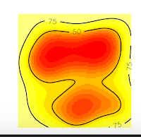
And we obtain these nice plots. Now, we want to extract the contour lines at 75% of probability density. For that, we will use the function to get vertices as the following code:

1 2 3 4 | # 10. Get vertices (Will be an Error) vkde_points <- getverticeshr(kud_points, percent = 75, unin = 'm', unout='m2') plot(vkde_points) |
And we will get an ERROR!! Specifically, we will obtain the error I introduced at the beginning of this post.
Error in getverticeshr.estUD(x[[i]], percent, ida = names(x)[i], unin,: The grid is too small to allow the estimation of home-range. You should rerun kernelUD with a larger extent parameter
But why this happened? If you are a shrewd observer, you'll notice in the above plots that, the contour line at 75% is cut, and our domain doesn't include it. So, that is the reason for the error, is that R can't estimate the vertices of the contour line at 75% precisely because they are no in the domain, they were not computed. On the contrary, the contour line at 50% is entirely inside the domain, so if we ask for this vertices, we won't have any error.
1 2 3 4 | # 10. Get vertices (Will be an Error) vkde_points <- getverticeshr(kud_points, percent = 50, unin = 'm', unout='m2') plot(vkde_points) |
Now, if we want to extract 75% contour lines without an error, we only need to increase the grid in order to cover all the contour lines. In this case, I will increase the grid at 50 (see the item # 5. Domain x <- seq(-50, 150, by=1.) y <- seq(-50, 150, by=1.))
1 2 3 4 5 6 7 8 9 10 11 12 13 14 15 16 17 18 19 20 21 22 23 24 25 26 27 28 29 30 31 32 33 | # 5. Domain x <- seq(-50, 150, by=1.) # resolution is the pixel size you desire y <- seq(-50, 150, by=1.) xy <- expand.grid(x=x,y=y) coordinates(xy) <- ~x+y gridded(xy) <- TRUE class(xy) # 6. Kernel Density kud_points <- kernelUD(points, h = "href", grid = xy) image(kud_points) # 7. Get the Volum vud_points <- getvolumeUD(kud_points) # 8. Get contour levels <- c(50, 75, 95) list <- vector(mode="list", length = 2) list[[1]] <- as.image.SpatialGridDataFrame(vud_points[[1]]) list[[2]] <- as.image.SpatialGridDataFrame(vud_points[[2]]) # 9. Plot par(mfrow = c(2, 1)) image(vud_points[[1]]) contour(list[[1]], add=TRUE, levels=levels) image(vud_points[[2]]) contour(list[[2]], add=TRUE, levels=levels) # 10. Get vertices (Will be an Error) vkde_points <- getverticeshr(kud_points, percent = 75, unin = 'm', unout='m2') plot(vkde_points) |


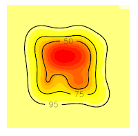
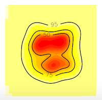
Now, all the contour lines are inside the grid, so we'll no see the error message. And that's all.
Sunday, 28 January 2018
On species accumulation curves
1 2 3 4 5 6 7 8 9 10 11 12 13 14 15 16 17 18 19 20 21 22 23 24 | # Dependences library("BiodiversityR") library("vegan") # Loading data data(BCI) # Using vegan package sp1 <- specaccum(BCI, method = "exact") sp2 <- specaccum(BCI, method = "random") # Using BiodiversityR package sp3 <- accumresult(BCI, method = "exact") sp4 <- accumresult(BCI, method = "random") # Comparing results using plots par(mfrow=c(1,2)) plot(sp1, col = "black", lwd = 3, xlab = "Samples", ylab = "Richness", main = "exact") plot(sp3, col = "red", xlab = "Samples", ylab = "Richness", add = TRUE) plot(sp2, col = "black", lwd = 3, xlab = "Samples", ylab = "Richness", main = "random") plot(sp4, col = "red", xlab = "Samples", ylab = "Richness", add = TRUE) legend("bottomright", c("vegan","BiodiversityR"), col = c("black","red"), lty = 1) |
1 2 3 4 5 6 7 8 9 10 11 12 13 14 15 16 17 18 19 20 21 22 23 24 25 26 27 28 | # Dependences library("BiodiversityR") library("vegan") # Loading data data(BCI) # Using vegan package sp1 <- specaccum(BCI, method = "exact") sp2 <- specaccum(BCI, method = "random") # Using BiodiversityR package sp3 <- accumresult(BCI, method = "exact") sp4 <- accumresult(BCI, method = "random") # Comparing results using plots par(mfrow=c(1,2)) plot(sp1, col = "black", lwd = 3, xlab = "Samples", ylab = "Richness", main = "exact") plot(sp3, col = "red", xlab = "Samples", ylab = "Richness", add = TRUE) plot(sp2, col = "black", lwd = 3, xlab = "Samples", ylab = "Richness", main = "random") plot(sp4, col = "red", xlab = "Samples", ylab = "Richness", add = TRUE) legend("bottomright", c("vegan","BiodiversityR"), col = c("black","red"), lty = 1) # Estimators sp1_pool <- poolaccum(BCI, permutations = 1000) plot(sp1_pool) |
The object created by "poolaccum" function gives you by default a figure using parameters of the "lattice" package:
1 2 3 4 5 6 7 8 9 10 11 12 13 14 15 16 17 18 19 20 21 22 23 24 25 26 27 28 29 30 31 32 33 34 35 36 37 38 39 | # Dependences library("BiodiversityR") library("vegan") # Loading data data(BCI) # Using vegan package sp1 <- specaccum(BCI, method = "exact") sp2 <- specaccum(BCI, method = "random") # Using BiodiversityR package sp3 <- accumresult(BCI, method = "exact") sp4 <- accumresult(BCI, method = "random") # Comparing results using plots par(mfrow=c(1,2)) plot(sp1, col = "black", lwd = 3, xlab = "Samples", ylab = "Richness", main = "exact") plot(sp3, col = "red", xlab = "Samples", ylab = "Richness", add = TRUE) plot(sp2, col = "black", lwd = 3, xlab = "Samples", ylab = "Richness", main = "random") plot(sp4, col = "red", xlab = "Samples", ylab = "Richness", add = TRUE) legend("bottomright", c("vegan","BiodiversityR"), col = c("black","red"), lty = 1) # Estimators sp1_pool <- poolaccum(BCI, permutations = 1000) plot(sp1_pool) # Plot manipulating lattice plot(sp1_pool, display = "chao", col = "black", auto.key = FALSE, grid = F, strip = FALSE, xlab = "Sample", par.settings = list(axis.line = list(col = 0)), scales = list(col=1, tck=c(1,0)), panel = function(...){ lims <- current.panel.limits() panel.xyplot(...) panel.abline(h=lims$ylim[1], v=lims$xlim[1]) }) |
Monday, 24 July 2017
Projecting coordinates in Python
1 2 3 4 5 6 7 8 9 10 11 12 13 14 | import matplotlib.pyplot as plt import numpy as np import pandas as pd import utm lat = np.linspace(20, 40, 100) long = np.linspace(60, 70, 100) index = np.arange(1,101) d = {'x': pd.Series(lat, index=index), 'y': pd.Series(long, index=index)} df = pd.DataFrame(d) print(df) |
Done!, we have already created a Dataframe with one hundred of spatial points in decimal degrees. Now, we are going to project them to UTM. First, we make a temporal "temp" variable which will store our projected XY coordinates. Afterwards, we are going to use the function utm.from_latlon() in a loop. This instruction will put each project coordinate in your variable "temp" that you created recently.
1 2 3 4 5 6 7 8 9 10 11 12 13 14 15 16 17 18 19 20 21 22 23 24 25 | import matplotlib.pyplot as plt import numpy as np import pandas as pd import utm lat = np.linspace(20, 40, 100) long = np.linspace(60, 70, 100) index = np.arange(1,101) d = {'x': pd.Series(lat, index=index), 'y': pd.Series(long, index=index)} df = pd.DataFrame(d) #print(df) temp = [[None]*1 for ii in range(len(df.x))] ## Use the utm package to transform coordinates for i in np.arange(0, len(df.x)): temp[i] = utm.from_latlon(df.y[i+1], df.x[i+1]) # Transform in a dataframe data = pd.DataFrame(temp) data.columns = ['X', 'Y', 'Zone', 'Code'] print(data) |
Finally, we convert the projected data to a DataFrame and assign this to a new variable "data", and that's all. This procedure helps me to transform a database with two hundred thousand locations, so it is useful to project massive databases.
Thursday, 20 July 2017
Diffusion equation
It can be discretised using numerical methods. In this case, we are going to use the finite difference method, so that the above equation can be discretised as follows:
$\frac{u^{t+1}_{i} - u^{t+1}_{i}}{\Delta t} = D \frac{u^t_{i+1} - 2u^t_{i} + u^t_{i-1}}{\Delta^2x}$
where, $t$ indicate the time set and $i$ the x position.
To obtain the steady-state, we are going to programming this in python. The below code solve the diffusion equation numerically
import numpy as np
import matplotlib.pyplot as plt

#Setting parameters
nx = 101
dx = 0.01
nt = 20000
D = .1
dt = 0.0001 #be aware setting this value

#Initial conditions
u = np.zeros(nx)
u[25:75] = 2
un = u.copy()

#Numerical scheme: Finite differences
for n in range(nt):
    for i in range(1, nx-1):
        un = u.copy()
        u[i] = un[i] + D * dt /dx**2* (un[i+1]-2*un[i]+un[i-1])

#Plot the results
plt.plot(np.linspace(0, 1, 101), u)
plt.ylim(0, 4)
plt.xlim(0, 1.)
plt.show()
The solution is
Where it is shown how the distribution diffuses across the domain; however, as time passes, the distribution density tends to zero, so that the mass conservative property is not satisfied. If we wish to maintain a constant mass, we have to apply boundary conditions, in this case, we need to set-up a zero flux condition in the extremes of the domain. Then:
$\frac{\partial u}{ \partial t} = 0 $
import numpy as np
import matplotlib.pyplot as plt

#Setting parameters
nx = 101
dx = 0.01
nt = 20000
D = .1
dt = 0.0001 #be aware setting this value

#Initial conditions
u = np.zeros(nx)
u[25:75] = 2
un = u.copy()

#Numerical scheme: Finite differences
for n in range(nt):
    for i in range(1, nx-1):
        un = u.copy()
        u[i] = un[i] + D * dt /dx**2* (un[i+1]-2*un[i]+un[i-1])                                                                                                       # Zero flux condition
        u[0] = u[1]
        u[-1]= u[-2]
#Plot the results
plt.plot(np.linspace(0, 1, 101), u)
plt.ylim(0, 4)
plt.xlim(0, 1.)
plt.show()
Here, zero flux condition is included straightforward by adding: u[0] = u[1] (left) and
u[-1]= u[-2] (right). Then, the mass can not go outside of the domain.
But!, be careful, because this zero flux condition only works for this simple equation. If you are working with different models, for instance, the advection-diffusion equation, zero flux condition has to be implemented differently.


